Tuesday, May 31, 2011

Zoya "French Twist" Manicure with Caitlin and Dove

I'm not huge into nail art, but I do love to save my "fun" manicures for the weekends.  Unfortunately my complete lack of creativity typically means my "fun" manicures are just my "not-quite-work-appropriate" colors like brights and glitters.  Thankfully my dearly beloved polish brand Zoya gave us this little piece of genius last weekend:


You can find much more information about the story behind this style here at All Lacquered Up, but basically this was a look created by Zoya for Fashion Week.  Zoya did a quickie promo for a free bottle of each polish, Caitlin and Dove (and I'm a terrible blogger for not letting you guys know about it while it was still relavent - forgive me!!), and since I already had both, the French Twist was a done deal for me.

For this look, the base color is Zoya Caitlin - a medium dusty periwinkle purpley-blue creme.  This color is right up my alley.  It's gorgeous and applies beautifully in two coats.  

(click to enlarge)

Swoon.  I love these colors.  If I had to identify my weakness in terms of polishes, dusty blues would be it.  I wore Caitlin as a full manicure for a day, just to admire beauty all by itself (it also helps once you get to the next step).  :-)  

The next day, I added the tips.  I used Scotch tape to block off everything but the tips (You can find a tutorial from here from Erika at Chloe's Nails - she's a pro at the Scotch tape thing!), and then did one layer of Dove across the tips.  Scotch tape is a little difficult for me to use, because my nails are so curvy that it doesn't really lay completely flat, but my cleanup brush and a little non-acetone remover fixed any wiggly lines.  I added one coat of Barielle Manicure Extender top coat to finish it all up!

(click to enlarge)

Ok, so not perfect, but I think it turned out pretty well!  I love how these two colors look together.  They make for a kind of subtle "funky french."  Unexpected and lovely!  I got several compliments on this manicure!  :-)

These two colors are total winners for me.  I already raved about Caitlin, but even Dove gets a thumbs-up from me.  It's a standard dove grey, but it seems to flatter most skin tones, and it applies just as nicely as Caitlin.  The two colors compliment each other well, but are both nice enough for a stand-alone manicure.  Well done, Zoya!
_______________________________________________________________________________

On a completely different note, I finally convinced my swapper-turned-real-life-friend-and-dusty-hunting-partner-in-crime Jessie to do some guest posts for my blog!  I'm so excited to see what she has in store!  Give her a warm welcome for her first post, which should arrive soon!  I know you'll all love her! :-)

Courtney

Thursday, May 26, 2011

Zoya Gemma

Work has been a total beast for me this week.  Ya know when you just have one of those days where nothing goes right and you can't get anything done?  Yeah, I had three of those in a row this week.  Not cool, life!  Not cool...

So, being late to the party as usual, finally got around to trying out Zoya Gemma.  It was released with the Intimate collection in January of this year, but I waffled on getting it for about three months after that.  I really need to stop doing that.  It's how I end up with the dreaded reverse buyer's remorse.  But anywho, I finally brought home Gemma in a swap, and here she is!

Gemma is a medium-toned, almost army green polish with subtle blue and pink shimmer.  I'm SO glad I was able to capture the shimmer for you in my photos!  It's not a super noticeable shimmer, but it's not one of those "secret shimmers" like Essie Sew Psyched where the pretty shimmer in the bottle disappears on the nail.  Most of the time it looks like a creme, but when the light hits it, you can see this pretty blue flash (unfortunately the pink shimmer just goes MIA on the nail).  Application was pretty smooth - no real complaints.  I used two medium coats, but I probably could've used a third, as I had a few patches I noticed after I finished.  Click to enlarge these photos to get a better look at the shimmer!

(click to enlarge)
 (click to enlarge)

That blue flash is so pretty!  It certainly sets it apart from other muted greens.  I've got nothing like it in my collection.  Hubby liked this one, and I did too, but I wasn't really wowed by it.  I'm gonna blame it on my really crappy work week, because it looks killer in these photos (if I do say so myself)!  :-P

I LOVE that with Zoya you don't have to worry about if a polish is limited edition.  Every polish collection becomes part of Zoya's huge core collection, so Gemma and her friends Caitlin, Dove, Marley, Jules, and Dannii aren't going anywhere anytime soon.  As always, you can buy Zoya polishes at www.zoya.com.

Are you guys as ready for the weekend as I am?!  I think I'm gonna have one (or two or three...) stiff drinks with my name on it after this week!  :-)

Tuesday, May 24, 2011

OPI Tease-y Does It

Hola, friends!  Hope your weekend was a fabulous one!  Given that the world, indeed, did not end, I'm gonna say that mine was definitely good.  After my Pirates of the Caribbean swatch-a-thon on Thursday, I needed a palate-cleanser.  Typically this is a nude/pale color and it comes after wearing something glittery/shimmery/bright, etc.  After six pastels and numerous comparisons of other random pastels, I needed something deep and sultry.  I dove head first into my stash for OPI Tease-y Does It.

Tease-y Does It (yes, another stupid name from OPI) was released with the Burlesque collection from this past holiday season.  Burlesque was a collection full of glitter bombs and duochromes, so Tease-y Does It almost seemed out of place.  I never thought twice about buying it until I started to see the swatch photos on MUA.  There's more to this polish than meets the eye.

Its deep plum-brown base is almost cloudy and murky-looking in the bottle.  I assure you that all goes away on the nail to reveal the best feature of this polish - its gold/fuchsia duochrome shimmer.  The duochrome isn't super noticeable, but you do certainly get the flash of both colors.  Application was fabulous in just two coats.  It practically applied itself!  Definitely click to enlarge these photos so you can see this baby up close!

(click to enlarge)
 (click to enlarge)

How sexy is that?!  When I first put this on last December, I was shocked by how much I loved it.  It's not too dark - doesn't even come close to "almost black" - and was just what I needed after those Pirates pastels.  Just as pretty the second time around.  Ahhhh....

Unfortunately the Burlesque collection was limited edition, which means you may have a hard time tracking this one down.  Though it could still be lurking in your Ulta's clearance section, so check that out for sure!  The good news is that Nubar's Raspberry Truffle is said to be a dead-on dupe!  You can get it for $7.49 at www.bynubar.com.  Double good news is that both of these are also almost dupes of Chanel's Feu de Russie.  Anytime I can get something close to a Chanel for less than half the price, I consider that a VICTORY!

A perfectly unexpected palate-cleanser.  :-)

Friday, May 20, 2011

OPI Pirates of the Caribbean plus Silver Shatter

Ahoy, mates!  I've got goodies for you today!!  I've been waiting FOR-EV-ER for this order to be shipped to me, as I pre-ordered from a wholesaler back in March.  Still no word on my order, so I decided to check my local beauty supply store to see if they had them in.  Lo and behold, an entire set waiting just for me!  (Okay, not really just for me, but I really did luck out!)  I canceled my online order so fast it would make your head spin, and it's been a swatch-a-thon all afternoon!  Just in time for the movie release today, I am SOOOO excited to bring you the entire OPI Pirates of the Caribbean collection!  YAY!

When I first heard OPI was doing a Pirates of the Caribbean collection I was like:

Then I found out they were all cremes and pastels, and I was like:

Then I realized the error of my ways.  Just because pastels don't really say "pirates" or "swashbuckling" to me, doesn't mean they don't need love too!  The promo photos looked gorgeous, and I knew I wanted every last one of them!  When I finally got my hands on the collection, I was like this:

(A quick thank you to Jessie for introducing me to http://www.jamesvandermemes.com/, and also a thank you to James Van Der Beek unknowingly starring in this blog post and for being awesomely hilarious!)  ON TO THE POLISHES!

Mermaid's Tears - A muted, kind of dusty creme that falls somewhere between turquoise and sea green.  I love this!!  A color with my name written all over it!  It's dupey to Orly Ancient Jade.  I don't own it, but I did a bottle comparison at Ulta, and while they're very similar, Mermaid's Tears is a bit lighter.  But I'd say if you own Ancient Jade, you can probably pass on Mermaid's Tears and vice versa.

I did a comparison of Mermaid's Tears with OPI Damone Roberts 1968.  You can see how much bluer Mermaid's Tears is.  It's not a mint green at all.

(L) OPI Mermaid's Tears, (R) OPI Damone Roberts 1968

Stranger Tides - Strange is right!  What color is this??  A dusty, greyed green, murky...celery?  I don't know but I LOVE it!  Surprise favorite of the collection!  It's soft but completely different from anything else I own.  It seems similar to Essie Da Bush, but I don't own it to compare.  I chalk this one up as an edgy neutral - I totally wore this to work and it played well in an office setting, and with multiple outfits.  

You've heard me mention "greyed green" before in reference to Essie Sew Psyched, but I did a comparison to show you how different these two are.  Look how yellow Stranger Tides is!  It makes Sew Psyched just look straight up grey!

(L) OPI Stranger Tides, (R) Essie Sew Psyched

Skull and Glossbones - Cute name!!  This is a pale grey creme.  Nothing too special going on here, but I like it.  I'm a sucker for greys.

I compared this to Zoya Dove, which I thought was going to be a really close match.  Wrong!  Skull and Glossbones is warmer, and Dove is darker.  Go figure!  I'd love to see Skull and Glossbones compared to Lippmann's Waking Up in Vegas, but sadly I don't own that one to compare.

(L) OPI Skull and Glossbones, (R) Zoya Dove

Steady as She Rose - Another cute name!  :-)  This one's a dusty pinkish lavender.  Sometimes it looks more pink and sometimes it looks more lavender.  It's nice, but I dunno - I'm just not feeling it.  To its defense, I don't own anything like it, so it's clearly unique!  

Sparrow Me the Drama - Aaaaaand THIS is why I don't do many pink manicures.  As soon as I pulled this one out of the box, I knew we weren't meant to be.  Light pinks don't like to play nicely with my skin tone, and this one was no exception.  Bleh.  I'm sure it would look fab on pretty much anyone but me.  Sigh.

I pulled out Essie Splash of Grenadine, another pink I could never get to work for me.  They're similar, but Sparrow Me the Drama is warmer.  I actually never realized just how blue Splash of Grenadine really was until now!

(L) OPI Sparrow Me the Drama, (R) Essie Splash of Grenadine

Planks a Lot - Dusty medium-toned purple.  Again, nothing too special here, but I do really like it.  It's not nearly as blue as this photo shows, but isn't that just the story of my life?  ;-)

I have a plethora of "dusty purple cremes" in my collection, so I brought them all out for this comparison.  I think Planks a Lot is much truer to color in this photo.  I thought this would be pretty close to OPI Done Out in Deco, but it's clearly darker.  Definitely in the same vein though.  Parlez-Vous, OPI? is much more red-toned - not even close.  It's closest relative seems to be Do You Lilac It?  Planks a Lot is a bit cooler-toned and not quite as bright, but they were pretty similar in real life.  Cool tones work better with my skin tone, so Planks a Lot is the keeper for me of the two.

(L) to (R) - Parlez-Vous, OPI?, Planks a Lot, Do You Lilac It?, Planks a Lot, Done Out in Deco

I was lucky enough to snag a bottle of Silver Shatter at Ulta on Mother's Day when the display was fully stocked, and I definitely wanted to swatch it for you!  As with Black Shatter, Silver Shatter needs to be applied over completely dry polish in order to crackle properly.  Polish takes forever to dry on my hands, so good on-the-nail swatches just weren't going to happen.  Boo!  More nail wheel swatches!  This is Silver Shatter over each Pirates of the Caribbean polish:

(L) to (R) Mermaid's Tears, Stranger Tides, Skull and Glossbones, Steady as She Rose, Sparrow Me the Drama, and Planks a Lot

I was never sold on getting Silver Shatter until someone on MUA said it was like jewelry for your nails! What a great description!  I think it looks nice over the Pirates polishes but I like a little more contrast with the shatter polishes.  So here's Silver Shatter over a couple other colors (click to enlarge for better detail):

(L) to (R) - Wet 'n Wild Black Creme, Milani White, OPI Russian Navy, OPI Ski Teal We Drop, China Glaze Jolly Holly, and Essie Limited Addiction

Overall, I think OPI put out a great collection.  They're not necessarily the most unique colors, but they work nicely, and they're great for spring/summer.  My only complaint is the application.  With the exception of Mermaid's Tears and Planks a Lot (which applied perfectly), the application on the rest of the Pirates polishes was AWFUL.  Terrible.  Turrible.  I don't even know how to describe it.  Almost...chalky?  And streaky.  And patchy.  Kind of like a neon.  It was really strange, and not even close to what I normally expect from OPI.  The only thing that saved those polishes from looking like crap was a good ole coat of Seche Vite.  I would say for those polishes, it's best to wait until each coat is completely dry before starting the next.  

That being said, of my four problem children, I'd say Stranger Tides and Skull and Glossbones are worth the hassle for me.  The other two just don't jive with my skin tone, and I just don't want to deal with awful application if I don't love the colors.  Silver Shatter gets the thumbs-up from me as well.  It doesn't shatter quite as nicely as Black Shatter, but it's still pretty cool, and the overall effect is nice.  I'd say the collection gets 3 out of 5 stars from me.  :-)

And just because it's fun to talk like a pirate - AAARRRRGHHH!  YO HO!  :-P
Thursday, May 19, 2011

Butter London MacBeth

You guys.  I realized the other day that I've been seriously neglecting an ENTIRE color - pink.  In fact, I've only ever shown one pink polish on here, that being China Glaze Ahoy!, and that was all the way back in February!  The funny thing is that it's not that I don't like pink.  I LOVE pink!  I just tend to wear all my pinks on my toes.  I guess it just makes me feel girly and summery (even when it's not so summery).  Well, no more!  I henceforth pledge to bring you more pink!!  I'd sign up to participate in Chloe's Nails' Pink Wednesdays, but to be honest I just don't own that many pinks.  So for today, I grabbed the first pink that's been nagging me to be tried - Butter London MacBeth.

As it turns out I did a really crappy job of picking a pink polish.  MacBeth is really more of a pink-leaning coral.  *womp womp*  Can we pretend this is more pink? In reality, it really is.  The photo is picking up way more orange/red tones than are present in real life.  It floats between pink and coral.  The formula on this one is fantastic, as usual.  The interesting thing is that this is definitely a creme, but the finish is almost jelly-looking, as I still had VNL (visible nail line) after two coats.  It's not really sheer, but it's clearly not really opaque, but definitely not a jelly.  Maybe if a creme and a jelly had a baby?  Yeah, that's it.

(click to enlarge)
 (click to enlarge)

First of all, I love the name!  MacBeth is hands-down my favorite Shakespeare play, and I'm not gonna lie - the name was probably at least half the reason I was interested in this polish in the first place.  Second, I LOVE the color!!  It's bright, but not in-your-face, and perfect for summer!  I got a ton of compliments on MacBeth, and even hubby loved it!  I loved this polish so much, I also made it my pedi color!  That's saying a lot - I can't even remember the last time I did a matching mani/pedi.  

S-M-I-T-T-E-N!!  ♥♥♥

Best news?  I know for a FACT that this sucker is in Butter London's core line!  Woo-hoo!  Next time you're in Ulta, peruse the Butter London display and give MacBeth a try!  It's the most perfect pinky-coral-summery-awesome color!  :-D

(And I promise I'll have a REAL pink for you soon!)

Tuesday, May 17, 2011

OPI Ski Teal We Drop

Alright, last one from the vaults and then we can get back to normal!  Today I have OPI Ski Teal We Drop, which I was gifted not once, but TWICE at Christmas.  I think the polish gods were trying to tell me something that day.  It was just meant to be, wasn't it?  :-)

Ski Teal We Drop is, as the name implies, a teal blue creme.  I feel like that description just doesn't give you the right idea.  It's really more like amazingly awesome teal blue nail candy from heaven.  I'm so not joking!  It applies in two absurdly smooth coats, and it's just the perfect teal creme - not too dark, and not too light.

(click to enlarge)

(Fun fact:  These were the first photos I ever took after I got my Ott-Lite!  You don't even want to see the photos from before the Ott-Lite.  Shudders.)

Ski Teal We Drop was released with OPI's Swiss collection in the fall of last year.  I passed on the entire collection at first, but then that I started seeing swatches of Ski Teal We Drop on MUA.  And thus, a lemming was born.  I added that sucker to my Christmas wish list, and my family must have just felt the vibes coming off of that one, since I managed to get one from each side of the family!  I did end up swapping my extra, but I'm cherishing every last drop of the bottle I kept!

I don't know what else to say about this polish other than it's perfect and I love it!  Maybe now you can see why I didn't love RBL Dead Calm.  I was hoping it would be my navy blue Ski Teal We Drop, but it's just really hard to top this polish.  I'm not sure if it's going to make it to OPI's core line (I can only hope!), but it should still be pretty easy to find right now.  If you're in the hunt for or are lacking a great teal creme for your collection, definitely check this one out!  :-D

Saturday, May 14, 2011

Butter London Victoriana

Exciting things are around the corner!  I'm so excited I could just explode!  I of course can't give them away just yet, but one of them might just be a review of the entire OPI Pirates of the Caribbean collection, plus Silver Shatter (yay!!).  As I only have part of the collection in currently, I've been wearing the ones I have so far, but I want to wait until the rest come in to do a full post for you guys (The previous sentence should be read as follows:  I pre-ordered the entire PotC collection from a wholesaler two months ago, but I'm too impatient to wait on them, so I picked up three of them at Ulta on Mother's Day.  Don't judge me, lol).  Therefore, I'll be digging into the archives - photos I've had for a while but just haven't put to good use yet - for the next couple of posts.  For starters I have Butter London Victoriana!

Victoriana is a medium-toned dusty blue creme packed with silver shimmer.  It's not the sparkly kind of shimmer, but the kind that just adds depth and texture.  Even though I feel like I had to dip my brush back in more often than with other polishes, application was super smooth - as I've come to expect from Butter London.  And surprise, surprise!  This one's almost a one-coater (but of course what I have below is two)!  I don't know how Butter London does it, but their polishes are always SO pigmented.  Click to enlarge these photos to get a better look at the finish on this one.

(click to enlarge)

Ahhhh, so beautiful!  It reminds me of heavy victorian fabric (fitting for the name, no?), but the overall look of this polish isn't heavy at all.  It was released with the Fall 2010 collection - you've heard me sing its praises time and time again - but it works just as well as a spring or summer color.  It's hard to tell in photos, but the base color is actually kind of green-leaning.  It's not a baby or pale blue (like China Glaze Sea Spray).  I have nothing like it!  Sophisticated, unique, and eye-catching.  My kinda polish!  :-)

I think I'm finally beginning to understand what core polishes are for Butter London after a recent trip to Ulta.  Seems like the stuff in the regular racks is core, while the ones on the separate display are seasonal.  My Ulta still had the Fall 2010 collection out as the seasonal one.  Shrugs.  Victoriana's not in the regular rack, so I'm thinking this may be limited edition, but either way it's very easy to find right now.  It's still in stock at www.butterlondon.com for the standard $14.  Worth every penny!  If you're a blue lover (and even if you're not), definitely check out Victoriana!  She is a stunner!

Tuesday, May 10, 2011

Orly Galaxy Girl

Hi guys!  A thousand apologies for taking so long to get this post to you!  Our modem died and left us without internet over the entire weekend into Monday.  It was awful - like someone cut off my right arm.  We finally got functionality back yesterday afternoon, but then of course it was the dreaded grocery day.  We all know how much I love grocery day.  Ugh!  Don't ever leave me again, interwebz!!  *Hyperventilates*  Anyway, on to the polish!  

Today I have for you another gem from my Orly Cosmic FX collection and its dupes, Galaxy Girl (I love that name!).  I had never planned on buying this one, as I wasn't that impressed with it from the swatches I'd seen, but when hubby saw it in the store he said it looked "badass," and therefore I had to buy it.  Well, you don't have to twist my arm!  ;-)

It's an odd bird in the flock, that's for sure.  It's a murky reddish plum base with super duochrome microglitter that flashes between aqua blue and fuschia.  After my last two one-coat wonders, I had completely forgotten that pretty much every polish from the Cosmic FX requires three coats.  Oops!  But trust me, this one applies super easily, and dries surprisingly quick, even as a three-coater.   And the best part?  It's JUST as duochromey on the nail as in the bottle!  Woo-hoo!!  Definitely click to enlarge these photos to check it out up close!


OooOoooh...Ahhhhh....

I have to be honest.  I thought this polish was going to be a total bust!  With that murky red-purple base, I thought it was going to look like a sparkly bruise.  Yuck!  But I stand corrected.  I loooove this!  It's just as badass as the hubby thought it would be!  I should listen to him more often.  :-)

The funny thing about duochromes is that you'd think they'd show off best in full sunlight, because they're so sparkly, but they actually love indirect lighting best.  So here are a few shots in natural, more dim lighting.  It really shows off the fuschia flash, but you can still see that sparkly blue!

(click to enlarge)

These photos don't even do it justice.  You've just got to see this one for yourself!  Thankfully it's still available on www.transdesign.com and www.amazon.com, even if at the full $10 price.  If you're into duochromes, definitely pick this one up while you still can.  If you don't own any duochromes, this is a great one to start off with.  Galaxy Girl definitely gets my seal of approval!  :-)    

Thursday, May 5, 2011

Rescue Beauty Lounge Dead Calm

Confession:  I'm a little weird when it comes to wearing my high-end or hard-to-find polishes.  What I mean is that after I wait months to get them or shell out way too much money for them, I often wait for "the right time" or "a good day" to wear them.  Damone Roberts 1968 was my BIGGEST lemming, and it still took me a good month to wear it!  GOSH Holographic has been sitting in my drawer since February, because I want just one good week of nothing but brilliant sunshine before I pull out that baby.  I don't mean to be so darn weird about it, but I guess I just figure that they're special, and I don't want to wear them if they're not going to get the chance to be fully appreciated (e.g. wearing a holo polish when it's raining for a week straight).  It's stupid, I know.

I FINALLY got over myself and tried out my first Rescue Beauty Lounge polish - Dead Calm.  (Note:  This is not actually my first RBL polish.  That honor goes to the lovely Catherine H, which I'm saving up...for the right time.  Sigh.  But this is the first one I've actually worn.)  I was super excited, because I'd read so much about how fabulous RBL polishes are and admired swatches for so long.  The creator, Ji Baek, is also AWESOME and has an amazing relationship with RBL fans (now known as ReBeLs).  What more could you ask for?

Dead Calm is a deep navy creme.  The name is pretty appropriate - it's just a really calm and serene blue.  It's absolutely gorgeous in the bottle.  I've heard rave reviews of the legendary RBL formula, and I can finally say for myself that they're not kidding.  This stuff applies like buttah!  And in one coat!  One coaters are almost mythical, because you just don't really come across many, but here I managed to find two in a row!  :-)

(click to enlarge)

I'm gonna throw you guys a curve ball here.  I really don't love this.  I feel like someone needs to take my temperature, because Dead Calm has my name written all over it in the bottle, but it was just lacking the magic on the nail for me, mostly for three reasons:

1) The above color is beautiful, but this is only the color you'll see in good bright lighting or sunlight.  Here's how it looks in pretty much every other light:


Most of you are probably scratching your heads wondering what the heck the problem is.  It's not bad, but it's just a bit too dark for me.  It's actually a good few shades darker than the bottle color, which makes me sad, because I just ADORE that bottle color.  I have nothing like it in my stash!  Maybe I should've saved this one for a sunny day?

2)  It's one-coat nature is almost its downfall.  It's SO pigmented.  I know I sound crazy, because it's hard to imagine a complaint about high pigmentation, but DAMN.  Clean-up was almost impossible and took me about 30 minutes, because every time I got near it with acetone, it just bled more of that super-pigmented blue.  Apply this one VERY carefully and you can avoid this, but not knowing this ahead of time made it really frustrating for me.  Removal was just as much of a pain.  I had to remove all of it once and then go back a second time to get all of the blue remnants off my skin.  Dare I say, I might just prefer to remove a glitter than to remove this one again!

3)  It's $18.  I can put up with Reasons 1 and 2 with a cheap or even mid-range polish, but $18??  No thanks.  Luckily I got Dead Calm in a swap with a lovely lady in my area, so I didn't shell out all that money for it, but I'm certainly still cautious to put my recommendation on it.  I want to love this polish so much, but I just don't.

That all being said, Dead Calm has stellar reviews from pretty much everyone else on the planet, so if you're looking for a good deep blue with amazing application and you have $18 to spare, it may be worth checking out for yourself at www.rescuebeauty.com.   

Happy shopping, and I promise to start busting out some of those other polishes for you!  :-)

Monday, May 2, 2011

Butter London Marrow

In my last post I mentioned how I layered Butter London No More Waity Katie over Marrow.  In fact, the only reason I bought Marrow was to use as "underwear" for No More Waity Katie.  Usually when I do layering combinations, I like to throw in a photo or two of the base polish just for fun.  It's like a two-for-one!   Well, I was just so smitten with Butter London Marrow, that I just had to do a full post on it. So, as promised, here goes!

Marrow was released with Butter London's Fall 2010 Collection (The same AMAZING collection that included Victoriana, Bumster, and All Hail McQueen/the Queen) and was custom mixed for the Vena Cava designers for Fashion Week.  Butter London says it was named after "the dark purple, rusty center of a bone."  First, I didn't really realize that bone marrow was actually purple.  For some reason I always thought it was maybe a deep red, like blod.  Second...ew?  Not sure why anyone would want to name a polish after bone marrow.  I guess there's supposed to be a connection between bone marrow and vena cava, the major vein to the heart?  Kind of strange, if you ask me, but I suppose I'll try not to question the thought process that gave us such a lovely polish.

Marrow's color is just described of its namesake, a red-leaning purple that falls somewhere between mid to deep toned with very fine silver shimmer.  Unfortunately, the shimmer isn't as apparent on the nail as it is in the bottle.  Reminds of the shimmer in Essie Sew Psyched.  From time to time in the right light at the right angle, you can see the secret shimmer, but you can pretty much think of Marrow as a creme.  Application was amazingly smooth, and what you see here is only one coat!  ONE...COAT!  I die!  Since Marrow is a purple, it was of course impossible to accurately photograph.  I color-corrected these photos a bit to get it as close as I could to the correct color.

(click to enlarge)


The photo below was taken without my Ott-Lite, in just the natural lighting of my dining room, and is very color-accurate:

Don't be fooled - even though this is definitely a "rusty" purple, it's still somehow vibrant.  It's not a blackened purple or a greyed purple.  Here's a photo of Marrow compared to Revlon Perplex (dupe of Chanel Paradoxal):

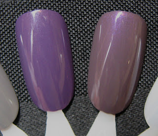
(L) Butter London Marrow, (R) Revlon Perplex

See how much more vibrant it is?  It's so much more purple, and almost makes Perplex look brown!  I definitely don't have a dupe for Marrow in my stash.  It's completely unique for me!  I was so surprised with how much I loved it!  We all remember my love affair with Illamasqua Baptiste, and while Marrow didn't knock it from being my #1 Purple, it's definitely my #2!

I'd say if you love purples, Marrow is a MUST have!  I'm so happy that every Ulta will now be carrying the Butter London line!  So much more accessible!  To be honest, I'm not sure if Marrow is part of Butter London's core line.  It appears to be, as it is available at http://www.ulta.com/ and http://www.butterlondon.com/, but I'm not 100% sure. Either way, I highly recommend picking this one up!  Even at the mid-level $14 price, Marrow is unique in color and with an unbelievably smooth one-coat application, it's totally worth it!